While I am no pro photographer, I do really enjoy taking pictures, which is good because that is the only way that my family ever gets anything documented, although I swear it drives them nuts. I have taken many courses over the years, starting when I got my first camera in my tween years. Most of the photos I take are reposted from elsewhere as my camera, until recently, has pretty much sucked. I now have one that takes good pictures, but is not a point and shoot type thing that you carry around with you everywhere. So don't use the photography on my site as a guide, but I have picked up a few tricks here and there that I thought people might find useful,
especially a short course I took a few months ago on
product photography.
It was in this most recent class that I learned the most valuable lessons yet. Many courses focus on things like shutter speed and aperture, and to be honest, as most people are using digital cameras now that take care of those things automatically, it is sort of a side thing these days. What I mean is, while it is very helpful to understand what those things mean, and why they work the way they do to create a photo, they imply that your focus should be in the workings of the camera. If you are not taking up photography as a hobby though, you are probably only looking to make your stuff look good. And product photography is
very different than snapping photos of your friends or pretty pictures of the garden. This is something that until very recently, I found terribly annoying. I know I understand the basics of photography, and the pictures I was taking
should have been fairly good, but they were lacking in oomph. So what exactly was the problem?
In the second half of this post, I will try to recap what genius I found in that last class. It really made a lot of things simple to pick up. But first let's get the basics out of the way. I find that a little bit of journalism training in my early years and having a photographer for a stepdad helped me out wonders with general guidelines. Many people teaching classes I think forget to teach the first things that they learned because they are so ingrained that they have forgotten that they had to learn them in the first place. While you may be focused on getting your presentation right, it helps immensely to understand why your camera is doing what it is doing.
DSLR vs Compact Digital For the purpose of this post, we will simply say that a compact digital is a much simpler camera than a DSLR. Point and click is simpler and easier to use, but is limiting in what you are able to accomplish because it is mostly automated. You have less control over your settings and your
photographic triangle. But they are inexpensive and easy to tote around with you. More detailed info about how a DSLR works
here.
The photographic technical triangle: Aperture, Shutter Speed, ISO
Throw these words around and you will sound very impressive. Understand what they mean and you will take impressive pictures. I am not going to refer here to things like F-stops and things with letters and numbers as this is what I think confuses most people, although it is handy to learn. Easy to look up online. The reason we refer to it as a triangle is that it is important to remember that all three must work together. I am going to explain it in terms of an old film camera, as I find it easier to understand visually, but remember that the same concept is reinterpreted in a digital camera, well... digitally.
 small aperture
 large aperture
You know those sci fi doors that open like a giant vortex in space ships? This is what the aperture of an old camera looks like. The aperture is basically the size of the hole that is open to take the picture through. This hole is what controls how much light gets in, (but keep in mind that your shutter speed also factors in this). Aperture allows your camera to create depth of field. What this refers to is how much your camera actually sees
in focus regarding foreground and background. The larger the aperture, the less of the shot will be clear. (I know this sounds backwards, but go with it.) This is were your camera can play with space and blur around your subject. In the above photo you can see the difference in what can be done with depth of field.
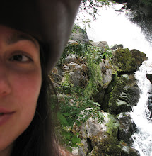
 example of shutter speed using a tripod
The shutter is the part of the camera that opens up to allow the scene to be imprinted onto the "film". The speed with which it opens and closes is what allows you to get either a crisp, clear shot, or a blurry one. This is not to be confused with focus, (which is more an aperture thing) which creates a different kind of blur (see above). If you are taking a picture of a moving car and you want the car to be clear you must use a high shutter speed. If you want to take a picture of a waterfall and you want the rocks and moss to be clear but the water to show movement, you would use a slower shutter speed. Most cameras have movement stabilization built in, but if you want to have movement in your shot, use a tripod or set your camera on something. If you are unable to change or don't understand shutter speed settings on your camera, this would translate into using the little running man as the icon. It refers to movement. If you were to want to take a picture of the running man, you would have to use a high shutter speed. Remember that your shutter speed is a factor in how much light is allowed to enter the camera. The higher the speed, the less light enters. The above photos illustrate how shutter speed can be used to convey movement.
 ISO example
Once upon a time, when you had to buy film, the ISO was the number on the film package. This number was to let you know how sensitive the film was to light. The type of photography you were doing was important because if you were shooting a portrait indoors you would want a film made for lower light and with better clarity than if you were outside on a sunny day shooting your kids soccer game. So with respect to digital photographs, the difference is that you don't have to worry about having the wrong film in your camera from the last time you used it. If you think of your picture as being made up of a kazillion little dots, it makes sense that the more dots you have, the better the quality of the photo. This is referred to as "fine grain" in the film world and "pixelation" in the digital world. Either way, we are discussing the quality and clarity of the photograph. A lower ISO would mean the film is less sensitive to light, but also has a finer grain. Your photograph might be slightly darker, but if you enlarge it, you will find that the quality is truer than higher ISO. In the above photo you can see (if you look closely) how the picture on the left is darker but higher quality than the one on the right.
The above photos are from
this site here which is remarkably easy to navigate and incredibly helpful in understanding digital photography. I would recommend a visit if you are looking to delve a bit deeper into the above aspects of your camera.
The Rules of Photography
Rule #1.
The first rule has always been
"keep the sun at your back". Now this is a good rule of thumb from the days when a camera was a film thing and it was exceptionally difficult to take a picture into the light, but these days, if you learn how to use your particular camera (and each is so different that you really need to play with settings to learn how good yours is with different light angles,) you can sometimes get some really fun shots with the light in front of you. I am going to change this rule to
"be aware of your light source". Understand where your available light is coming from and what happens to your product in this light. Where are the shadows? How much detail do you want? What kind of detail do you want, and is the angle of the light appropriate?
Play around with as many angles as you can, and see what the differences are. Take a lot of photos on different settings to see what captures the detail the best in said light. I will explain more about light in a bit, as this was perhaps the best information I found in my totally awesome product photography class.
 photo credit~Shannon Taylor via flickr
Rule #2.
Learn your camera. I get a kick out of people who have never even read their manual, they just take pictures with whatever setting it was on when they took it out of the box. To have favourite settings is normal, but don't sell yourself short by not knowing what your camera
can do (two words: mac ro). The further down the road, the more technology is erasing our errors in the photography department. This is why the dial is there in the first place, you pick a scenario and the camera sets itself up (remember aperture and shutter speed?) to take the best shot possible. Usually. There are always exceptions, and the more you learn about your camera, the better you will understand how to compensate for the camera's weaknesses. Mine sucks in the dark, so I don't bother to use it at night very often :)
 photo credit~arimou0 via flickr
Rule #3.
Divide into thirds. This is a lesser known rule, but I so wish that more people knew about this one as it would make life more aesthetically pleasing for them. In the same way that symmetry is calming and placing things in odd numbers is interesting, seeing a scene through a lens or in a box is the same. You are not looking for calming here, you want to grab people's attention. So you want to divide your box (the area of the photograph) into thirds, either horizontally or vertically. Or both, if that works for your vignette. Look at photos that you find appealing and notice that many of these use thirds in some way. An interesting people shot may have a face down in the lower left hand corner of the frame that anchors the scene. The purse in an ad may take up only 2/3 of the frame as a close-up. The field of wildflowers may be only the bottom third of the photo and the rest is just blue sky... all of these use thirds as a guideline to create interest for your eyes and mind.
 photo credit~isayx3 via flickr
Rule #4.
Address negative space. Negative space (or the space surrounding your product) is just as important as your product. If your eye is to be drawn
to something, it must be drawn
from something. The something that it must be drawn from, or over, is this negative space. Like white noise, it can have something in it, but it cannot be more interesting than what you
want to be seen. Be aware of this space and use it to your advantage. perhaps you set your product on a stack of antique books to bring out the old world feel of your vintage jewelry, but keep the books in a subtle colour scheme without too much contrast amongst them. Perhaps blur the negative space so that the focus must be on your product. This can work well, but be sure that the blur is slight, so the shot looks cohesive.
 photo credit~fairyfolk via etsy
Rule #5.
Understand Light. This is
by far the most important rule in photography and perhaps it means the most to me because it was the last thing I learned and has made such a
huge difference in my product photography. I tend to cheat by having learned to make the best of what light was available, but I had never learned to properly introduce light to my subject. This can mean manipulating the light that you already have (as in sunlight) or creating superficial light in the way that best highlights your subject. In order to do this though, you must first recognize what is available and what each type of light does and the effect it produces. THIS is what makes the difference!
There are basically
two types of light.
Diffuse light and
Direct light. (There is a really great technical term for direct light, but I can't remember it.) The biggest thing that I learned is that direct light is not bad, it is just one end of the spectrum. If you look up online or in courses, they seem to be in the "diffuse light at all times" camp. This was what I grew up with, but that leaves an entire part of the spectrum unused. All artists know that
that isn't a good thing, so learn and use the difference.
Direct Light: lights that are glaring and direct such as halogen bulbs or harsh sunlight of mid-day are examples. This light produces shadows which is why we are told to avoid it, it is particularly unflattering to people in photos if you don't reflect it in a bunch of different directions. HOWEVER for somebody who works with fabrics (such as myself) these shadows can be exactly what you want to show off detail. It picks up every little fibre and shows the texture of soft products.
 photo credit~shellonius via flickr
flourescent, filtered and overcast daylight are examples. This light washes out the shadows as it is coming from all directions. It is great for items with a lot of nooks and crannies as it throws light into all the shadows, leaving nothing hidden. It is probably the easiest to use because you don't have to worry about the direction the light is coming from. A lightbox (easy to make and to find directions online) is a great way to photograph products consistently using diffused light. It means that once you have the setup in place you will get consistent looking shots of your products without having to do everything in one go. Remember though, that the same principle that makes it easy to use can cause a washed out effect in your subject so it is important to understand the effect of both types of light.
 photo credit~Lidia Luz via flickr
Which one works best for your product? Well, there is a simple rule of thumb, although we all know that rules are made to be broken, so playing around with your available light is your best bet. But the basic idea is that if your
product (remember we are not talking about people) is
soft (non reflective) you want direct light. If your product is
hard (reflective) you want diffuse light. In most cases, the best thing is to have some of each, in the sense of a dress on a person, for example, you want direct light to bring out the fabric, but diffused light on the model.
If that is possible. If you are limited then keep that in mind when you are setting up your shot. Use direct light on your dress, and keep the dress as the main focus of the setup, leaving most of the model out of the shot, or in a position that the light won't be unflattering.
You can tell if you have hard or soft light (or for that matter, a hard or soft product) by the
light spot on the subject. If there is a dot (or three or four) of shineyness on your reflective subject then you have hard light. This is fine if that is what you are looking for. For example, a wine bottle might need both, say a direct light to make the bottle look sparkley, but a diffused light on the label to make it look soft and easily readable. This means that your bottle would be a hard, or reflective, subject but that the label would be a soft product.
 photo credit~themikepark via flickr
You can move light direction to your advantage by reflecting it with something as simple as a piece of white paper (and an assistant if you have one handy).
The last word I will give for now on light is about temperature. It comes in
warm and
cool types. Think sunset vs. a ski shot. There is more to this than just the snow on the ground. As a general rule, shots at midday will be in a bluish tone and shots at sunset or sunrise will have a reddish tone. If colour is really important in your product you want to consider this. If you are filtering your light, you might want to compensate for a reddish tone by filtering the light through a bluish fabric. Again, play around. I use reflection to change the light temp. Cloudy daylight makes for decent true colour and so do full spectrum lights.
"Staging" your product, product
"display" or
"styling" are ways of saying how you put things together in your shot. The props you use, the lighting, the angle the shot is taken from, and the general feeling that you get are all part of this. If you are having difficulty coming up with ideas, visiting sites like flickr are a good way to start. If you create a list of the things that stand out about your product this can help, but what about making lists about things that don't stand out and are less visable? For example, if you make vintage inspired jewelry, you might think to display them with other vintage accessories, like an antique mirror and stand. But what about the colours within the product? What if the tiny blue beads in your necklace were placed next to an old book or scarf with a blue tint? Keeping in mind that you don't want the props to fight for attention with the starlet of your shot, you can use this method to enhance some of the details of your product.
You can also do this with contrast or even with colours that make each other stand out. If your product is red, place it up against something in robin's egg blue. Using a colour wheel (you can google it) is a good way to find colours that are opposite each other, meaning that they contrast and help each other stand out. One thing to remember when staging is that you don't neccessarily need a bunch of props. Sometimes it is better to just use a simple background like a sheet or wood table, to keep your shot from becomming too busy. My take on etsy is that if you do one shot in a "scene" and the rest without props you are giving etsy something to choose from to use on the front page.
Last thoughts. If you don't have a tripod, use a stack of books or something similar to hold the camera steady if you need too. Clear and crisp photos are important. Also, remember that the current trend is towards light colours, white especially. This will change at some point, trends always do, but for now, look at your photo against others in an etsy front page grouping, not just next to your other photos, it will help you to see what is needed to make it fit. If you are stuck without a photo manipulation program, register online with
picnik which is a type of photoshop program. I have used it a bit and find it really simple to understand,
and it is free! It also makes it easy to transfer to sites like flickr and facebook etc. to post. Ummmm... I can't think of anything else at the moment, but I am sure I haven't covered all of it, so I will post again if there is stuff missing, and if you have questions, feel free to ask! I don't know if I will know the answer, but I will try the best I can. Remember that the most important thing is to PLAY around till you find something you like! And that all rules are meant to be broken :)
Happy shooting!


 small aperture
 large aperture
 example of shutter speed using a tripod
 ISO example
 photo credit~Shannon Taylor via flickr
 photo credit~arimou0 via flickr
 photo credit~isayx3 via flickr
 photo credit~fairyfolk via etsy
 photo credit~shellonius via flickr
 photo credit~Lidia Luz via flickr
 photo credit~themikepark via flickr


 Fluf Design out of Toronto creates soft products such as pillows, napkins, bags and the like with both a modern aesthetic and a commitment to sustainability. They also make available their textile prints as yardage to the trade, which is pretty brilliant.